COLOR
radiates from light, is reflected by surfaces, and is measured in wavelengths

Color
COLOR
Color radiates from light, is reflected by surfaces, and is measured in wavelengths.
The additive system of color measures light and the spectrum of color.
The subtractive system of light organizes pigment through the use of a color wheel or a chromaticity diagram.
Components of color are hue, saturation and brightness. Blends of color are described in tint, shade, blend and tone.
Color schemes or color palettes can be created in reference to the color wheel. Complementary, analogous, primary, secondary or tertiary…
Click the link below to watch a short video about the concept of color in art.

Color Wheel
Complementary colors are colors that are across from each other on the color wheel.
Analogous colors are any three colors in a row around the color wheel.
Primary colors are the colors that all the other colors are made from.
Secondary colors are colors made by mixing two primaries together.
Tertiary colors are colors that result from mixing a primary and a secondary color together
Warm vs Cool Colors
When artists talk about the temperature of color we are assigning a feeling to a perception. We talk about yellow, red and orange as making us feel warm and purple, green, and blue as making us feel cool. An artist can effect the way you feel by the colors he or she uses.
Warm and cool colors can also play a role in creating visual space. Warm colors tend to come forward in the picture plane while cool colors recede in space. This means an artist can use different colors to establish depth within pictorial space.
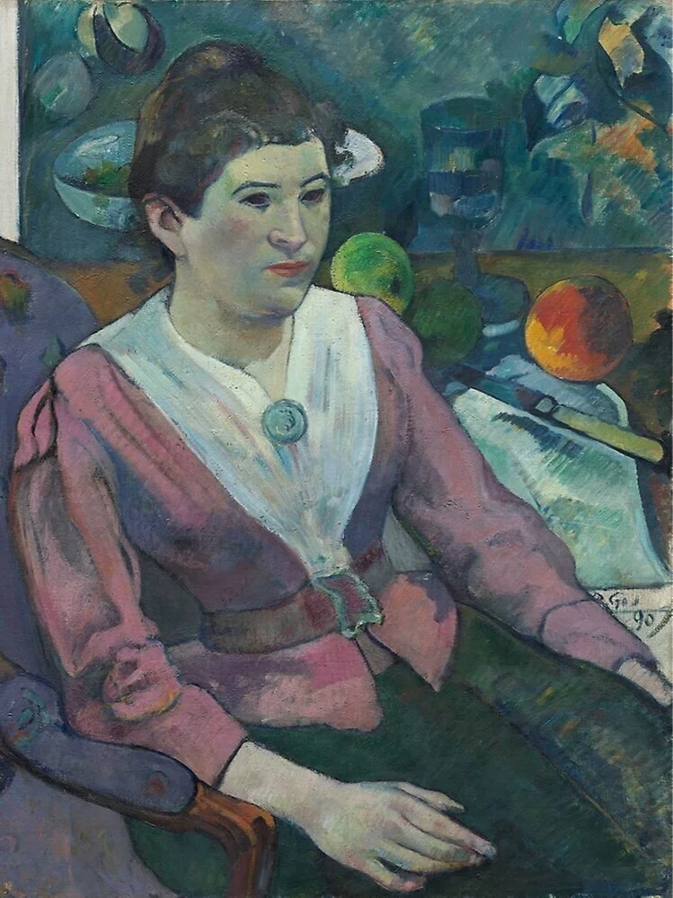
In the painting by Paul Cezanne on the right he uses mostly cool colors; blues, greens, and purple. However there are also some warm colored pears and a lemon that add both visual interest and spacial arrangement.
How to the cool colors in the painting make you feel about the work? Where does your eye go first?
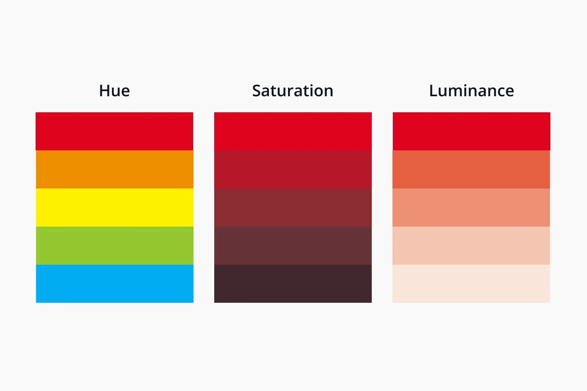
Hue: is the name we give to a color. Example: green, turquoise, red.
Saturation: the intensity or purity of the hue. In paint it would refer to how much pigment is in the paint.
Luminance: the perceived brightness of a color

Tint: a lighter version of a color by adding white to it.
Tone: also called value refers to how light or dark a color is.
Shade: a darker version of a color by adding black to it
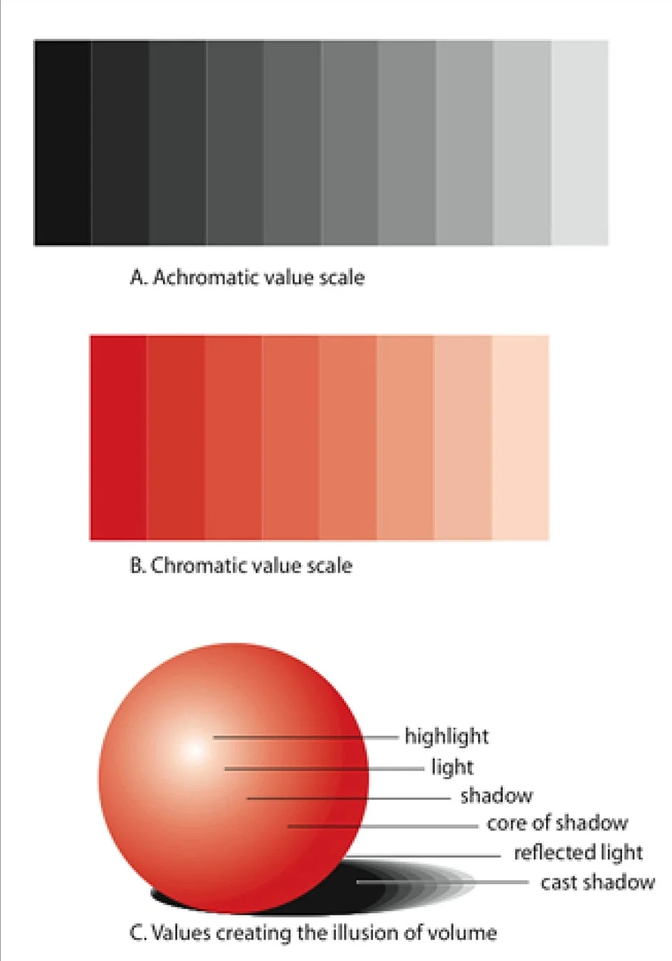
Colors have value
Value in color, as a range from light to dark, is similar to shading or modeling a form in black and white. If the artist wants to create a three dimensional form with color, he or she needs to understand how to adjust the value of the color in order to create a balanced gradation of tones. By paying close attention to the value of a color, an artist can create the seamless illusion of form in space.
A way to see the value of color would be to take a color image out of a magazine and photocopy it into black and white. Or take a photo from your phones library and select a black and white filter.
You will see all the underlying grays and blacks that relate to the perceived colors of the image.

Local Color
Color in traditional illusionistic paintings is descriptive. An artist attempts to match the color of an object in nature. Matching a local color can be difficult since most paints are not pure yellow or pure blue. Some blues may lean red and some blues may lean green. If you take the example of the color palette on the right you can see how many different variations of green you can create depending on which blue or yellow you start with. If you are trying to match the local color of a specific leafy green, and you do not have the correct blue and yellow, you will mix what is called mud or a muddy color.
Below, is an image of a color wheel representing this idea. If you were to use these colors to start, finding a clear local color would be more accessible.
The colors used are:
Alizarin Crimson + Ultramarine Blue = Purple.
Cerulean Blue + Lemon Yellow = Green Cadmium
Red + Cadmium Yellow = Orange


A painting using local color.

Expressive or Autonomous Color
In the nineteenth century, some artists begin to experiment with color as independent of the object it was from. These artists would use whatever color they felt like, or whatever color seemed to complete the work of art, regardless of what they saw. Color became creative and not descriptive.
In the twentieth century, artists like Yves Klein painted monochromatic paintings composed of one color on a canvas. This did not get rid of the subject as was intended by the artist, but made color itself into an independent subject for consideration.
Click the link below to watch a video on autonomous color in Paul Gauguin, Vision after the Sermon, or Jacob Wrestling with the Angel, 1888.

A painting using expressive color (View the video describing Gauguin’s idea behind expressive color).
Complimentary Colors and Optical Mixing
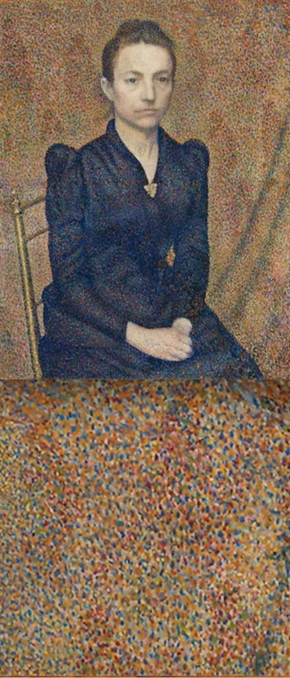
Artists used complementary colors like green and red, orange and blue, and yellow and purple. When these specific pairs of colors are next to one another they are visually vibrant. They effect us physiologically by demanding our visual attention. Some artists figured out that you could put a red dot next to a blue dot, and from a distance we would perceive those dots as purple. This is optical mixing.
Colors interact with each other within our eyes’ perception and our brain’s processing, so colors are not independent from what surrounds them.
Click the link below to watch a video on optical mixing in Georges Seurat, A Sunday on La Grande Jatte - 1884.

Relative Color
In 1971, Josef Albers published a book titled Interaction of Color. In his book he used illustrated examples to support his idea that,
“In visual perception a color is almost never seen as it really is—as it physically is. This fact makes color the most relative medium in art. In order to use color effectively it is necessary to recognize that color deceives continually. To this end, the beginning is not a study of color systems.”
In his classes at Black Mountain College, the students would use color construction paper to show that one can make the same color look different depending on its surrounding color. Also, one can make two different colors look the same, depending on the surrounding colors.

Two different colors can appear the same depending on the supporting color.

The same color can appear as two different colors depending on the supporting color.

Things to notice:
When you look at a work of art you can think about:
- What are the main colors or hues in the work?
- How do the value, saturation, and luminance or brightness of the colors affect the work?
- Are the colors mostly primary, secondary, or tertiary?
- Are the colors analogous or complementary? Warm or cool?
- Are the colors representing local color or is color being used in an expressive, autonomous way?
- How does the color in the work affect my overall experience of the art?
Vincent van Gogh. Roses. ce. 1890. Oil on canvas. Dutch. The Metropolitan Museum of Art.
Paul Gauguin. Woman in front of a Still Life by Cézanne. ce. 1890. Oil on linen canvas. French. Art Institute of Chicago.
William A. Harper. The Trees, Early Afternoon, France. ca. 1905. Oil on canvas. American. The Metropolitan Museum of Art.
Vincent van Gogh. Corridor in the Asylum. September 1889. Oil color and essence over black chalk on pink laid ("Ingres") paper. Dutch. The Metropolitan Museum of Art.
Paul Gauguin. Parau na te Varua ino (Words of the Devil). ce. 1892. Oil on canvas. French. National Gallery of Art.
Georges Lemmen. Portrait of the Artist's Sister. ce. 1891. Oil on canvas. Belgium. Art Institute Chicago.
Lady Musician Playing a Sitar. ca. 1800. Ink and opaque watercolor on paper. India (Rajasthan, Kota). The Metropolitan Museum of Art.