SPACE
the area between and around objectS
Space
SPACE
Space is the area between and around objects. The space around an object in art is called negative space; and negative space has shape. Space can also refer to the feeling of depth. Real space is three-dimensional; in visual art, when we create the feeling or illusion of depth, we call it space.
Space is shown on a 2 dimensional flat surface through the use of overlap, systems of perspective, and cultural norms of depiction.
Other kinds of spaces to consider are personal space, psychological space, outer space, and inner space.
Click the link below to watch a short video about the concept of space in art.
Creating space in two-dimensions
To create depth in the eye of the viewer, an artist may put attention to many aspects of the shapes, lines, colors and tones in an artwork.
- Size
- Overlap
- Placement
- Detail
- Color
- Value
Size
Larger objects appear closer. Smaller objects appear farther away.
Detail
As an object moves farther away it will lose detail. The more detail an object has it will attract our attention and bring it to the foreground.
Color and value
As objects move farther away they may become less saturated. Warm colors also tend to move forward in space while cooler colors recede in space.
Placement
Objects higher up on the picture plane appear farther away. Also, objects that are closer to the horizon line may appear more distant.
Overlapping
Shapes that overlap or obscure one another imply space. The shape in front will appear closer than the shape behind. This works for large objects in space as in, ‘the tree is in front of the house.’ It also works on a smaller scale as in ‘the line drawn for the kneecap should go in front of the line for the calf muscle.’
Putting it all together
When the concepts of size, overlap, placement, detail, color and value are employed harmoniously, the viewer will read the image as having a believable space.
If one or more of these concepts are ‘off’ each can create a tension in the work. This can be helpful or hindering, depending on the artist’s intention with the artwork.
Positive and Negative Space
In art the term positive space is used to describe the object while negative space is used to describe the space which supports or surrounds the object. When students are learning to draw it is often helpful to have them focus on drawing the negative space or shapes that define the object because their idea of ‘what the object looks like’ gets in the way of them seeing it as it really is.
Try drawing the negative shapes that make up a chair, or another object around you.
Notice the small negative abstract shapes that are found inside the sculpture. Learning to appreciate the negative space will enhance your appreciation of the total work of art.
Perspective in art
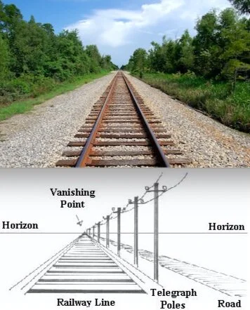
Perspective in art usually refers to the concept of linear perspective, the optical illusion using converging lines and vanishing points to make objects appear smaller as they get farther away from the viewer.
The rules of perspective applied in Western art are thought to be developed during the Renaissance in Florence, Italy, in the early 1400s. Prior to this time, paintings were stylized and symbolic rather than realistic representations of life. For example, the size of a person in a painting might indicate their importance and status relative to other figures, rather than their proximity to the viewer, and individual colors carried significance and meaning beyond their actual hue.
Linear perspective uses a geometric system consisting of a horizon line at eye level, vanishing points, and lines that converge toward the vanishing points called orthogonal lines to recreate the illusion of space and distance on a two-dimensional surface. The Renaissance artist Filippo Brunelleschi is widely credited with the development of linear perspective.
The three basic types of perspective -- one-point, two-point, and three-point -- refer to the number of vanishing points used to create the perspective illusion.
Click the link below to watch a video on Filippo Brunelleschi's experiment regarding linear perspective, c. 1420.
One-Point Perspective
One-point perspective consists of a single vanishing point and recreates a view when one side of the subject, such as a building, sits parallel to the picture plane.
Two-Point Perspective
Two-point perspective uses two vanishing points, one on either side of the subject, such as a painting in which the corner of a building faces the viewer.
Notice in the image how the directions of the lines change depending on the objects relationship to the vanishing point.
Three-Point Perspective
Three-point perspective works for a subject viewed from far above or below. Three vanishing points depict the effects of perspective occurring in three directions. All the lines will run to one of three points in the image.
Foreshortening
Foreshortening is a technique used in perspective to create the illusion of an object receding strongly into the distance or background. The illusion is created by the object appearing shorter than it is in reality, making it seem compressed. It is an excellent way to maximize the depth and dimension of paintings and drawings.
Foreshortening applies to everything that is drawn in perspective. This includes buildings, landscapes, still life objects, and figures.
Click the link below to watch a short video on how foreshortening works in art.
Trompe l’oeil
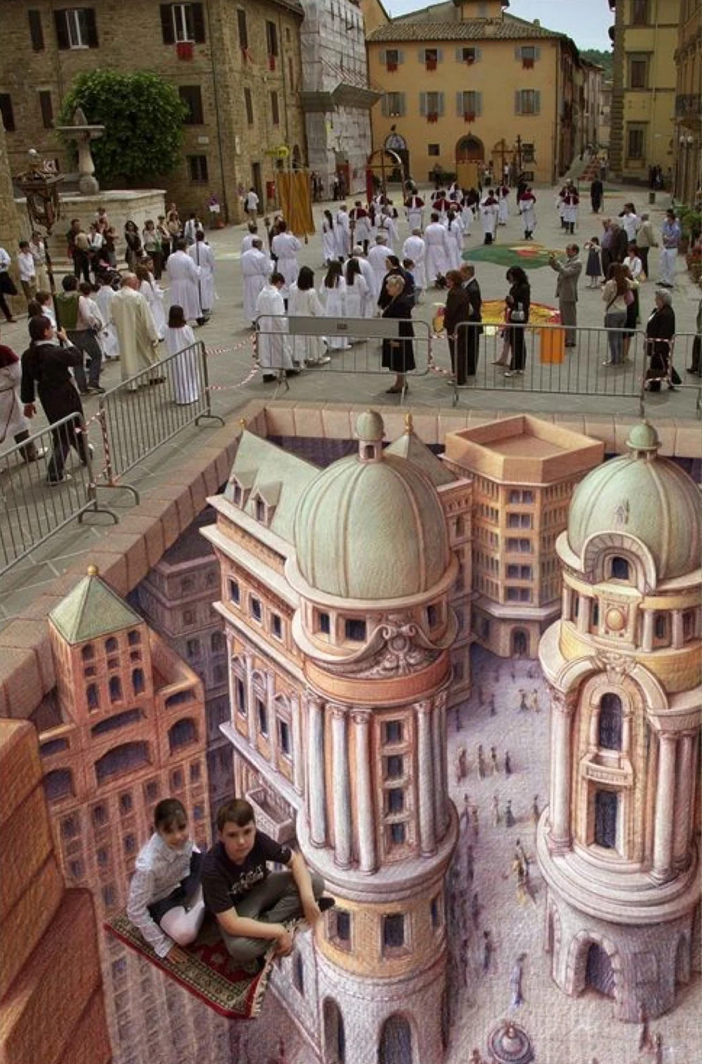
Trompe l’oeil, which is French for "deceive the eye," is an art technique that uses realistic imagery to create the optical illusion that the depicted objects exist in three dimensions.
Trompe l’oeil often contains a small piece of paper with one corner bent over, inticing the viewer to want to touch the work.
Anamorphosis
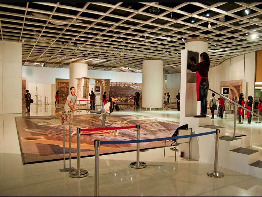
Anamorphosis is a distorted projection or perspective requiring the viewer to occupy a specific vantage point, use special devices, or both, to view a recognizable image.
Linear perspective in art forces the viewer into one specific fixed point with one eye like a camera. The viewer can ask his or herself if this is they way that he or she experiences life? The viewer may also recognize that the optical based image might be limiting.
Tools of Perspective
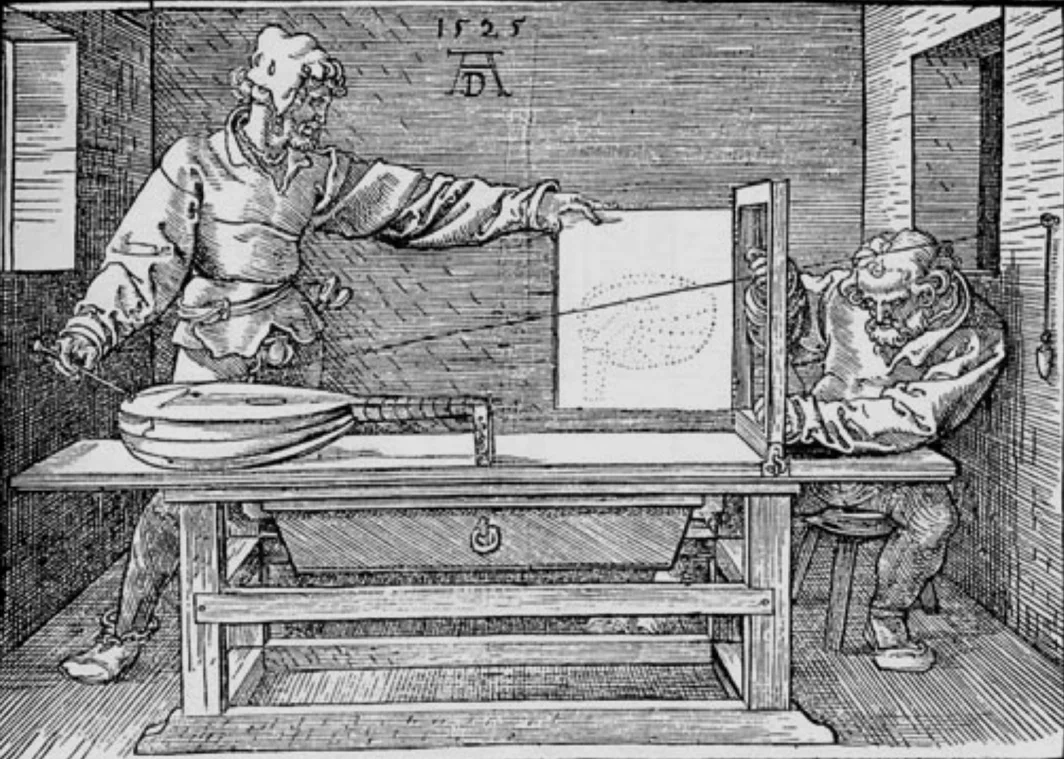
Western artists throughout history have relied on tools to increase their ability to create “realistic” images.
The Grid
Artists use a grid to help simplify the transfer of a complex image. A grid allows the artist to work more analytically and to worry less about sighting and proportion or complex measurements.
Also, if an artist wishes to scale up his or her work, he or she can place a grid over a sketch or smaller work, and note the images in the divisions.
Then, the artist would place a grid of equal proportion over a larger scaled area and draw or paint according to what was seen in the smaller grid.
Using a grid for a small to large image transfer helps the proportions to be more accurate.
Camera Obscura
The Camera Oscura is a simple but powerful tool. When an artist sets up a mirror or a lens through a pinhole into a dark room, a detailed color image is projected the interiors surface. An artist can then trace the projected image and stud it for questions about color and other compositional elements.
Click the link below to watch a video on how to create your own room-size camera obscure.
Space defined a movement
In the mid to late nineteenth century many artists were making work in response to the invention of the camera.
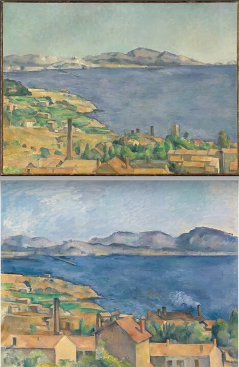
Artists like Paul Cezanne began making paintings without concern for the mathematical techniques of linear perspective. He was more interested in creating an image that contained all of the human experience - not just an optical experience.
This intentional shift created a pictorial space which became narrow and collapsed. The background pushed forward in pictorial space, offering the viewer a new image.
This collapsing of the picture plane is what defines the Modern Art movement.
From this point in time, artists find unique ways to process what they see, whether through Cubism or Abstraction as they put more emphasis on manipulating the formal elements of art, and begin to abstract space.
Things to notice
- how is a sense of depth created in the work
- linear perspective: is there a horizon line, is there a vanishing point?
- do the details recede in space?
- is there a distortion or lack of consistent perspective?
- how does the artist’s depiction of space affect the way I experience the work?
Paul Henry. A Section of the Constellation Cygnus (August 13, 1885). ce. 1885. Albumen silver print from glass negative. French. The Metropolitan Museum of Art.
George Inness. Early Morning, Tarpon Springs. ce.1892. Oil on canvas. American. Art Institute Chicago.
Edgar Degas. The Dance Class. ce.1874. Oil on canvas. French. The Metropolitan Museum of Art.
Figure: Seated Couple. 18th–early 19th century. Wood, metal. Dogon peoples. The Metropolitan Museum of Art.
Giovanni di Paolo. The Beheading of Saint John the Baptist. 1455–1460. Tempera on panel. Italy. Art Institute Chicago.
Egon Schiele. Reclining Woman with Raised Skirt. ce.1918. Charcoal on paper. Austrian.The Metropolitan Museum of Art.
William Michael Harnett. Still Life—Violin and Music. ce. 1888. Oil on canvas. American. The Metropolitan Museum of Art.
Paul Cézanne. The Gulf of Marseilles Seen from L'Estaque. ca. 1885. Oil on canvas. French. The Metropolitan Museum of Art.
Maurits Cornelis Escher. Ascending and Decending. ce. 1960. Lithograph on white wove paper. Netherlands. Art Institute Chicago.


